
A long, long time ago, in a classroom not so far away, the Herons surveyed the special people who came to visit them for Special Persons' Day. We asked a variety of questions including how many students had been in their 4th or 5th grade class, how far they had traveled to visit us, what their favorite ice cream flavors were, and, for those who were willing to share, how old they were.


After our guests had gone, we compiled our data. This was no easy feat. As soon as we started to collect information from the sheets, the students realized some of the complexities of data interpretation. What if someone had not answered a question? What if they answered it in a way we did not expect? We had collected individual ages – wouldn't it make more sense to group ages? If so, how should we group them?
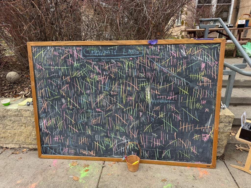
The practicalities of data collection also posed challenges – some students gathered information off of sheets but then had no way of knowing which sheets they had collected data from. Some students reported 24 pieces of data, some 26…who was right?
And then we needed to move from tallies or line plots (the technique most children used to gather the data off of the sheets) to a visual representation of the data that conveyed information more meaningfully. Most students created circle graphs of the information – an extension of the graphing work we did at the very beginning of the year. This time, our "whole" was not a friendly twenty respondents (in which each response= 5%) but twenty-four respondents. Students learned how to represent the data as fractions and then as percentages – a skill which we will continue to develop as the year goes on.
When we looked at the graphs, we were surprised by some of our results. We also realized we would love to ask some follow up questions. Finally, some students wanted analyze the results together such as looking at if there was a relationship between favorite ice cream flavor and age.


Working with data in a real world setting helps students understand how many decisions go into a graph they might see in a magazine or newspaper. Students also learn that numbers (maximum, minimum, mean, median) have meaning and can help them understand a situation.
In much more recent history, the Herons spent time on Friday analyzing a graphic from Scientific American about the number of degrees in different fields of science awarded to men and women. With our recent enthusiastic work in our coding theme, I thought the students might be interested to see how few females currently ended up in computer science and engineering programs. (As part of of our follow up discussion, students shared how those statistics might change as they got to be college age.)
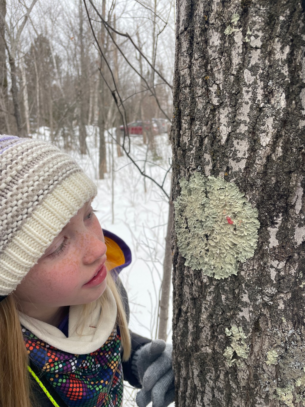
I purposefully gave the students very little support initially, asking them to puzzle out what the graphic is representing. All of the Herons felt confused at first – this was not a familiar topic and the graphic was complex. The students worked in pairs and had great conversations about what the different elements of the graphic meant. I asked them to develop two questions – a factual question that could be answered from the graphic and a "wonder" question that was inspired by what they were seeing. It was a wonderful conversation and we'll continue our exploration of visual information in the weeks to come.


Leave a comment