
Working with real data and analyzing what it's telling us is an on-going project in fourth and fifth grade. I have come to believe that it's one of the most important skills citizens in a democracy need. We are bombarded with studies and averages and graphs — unless we have a strong foundation in data handling, we are at the mercy of the people who are interpreting the data for us.
Civic Center Data
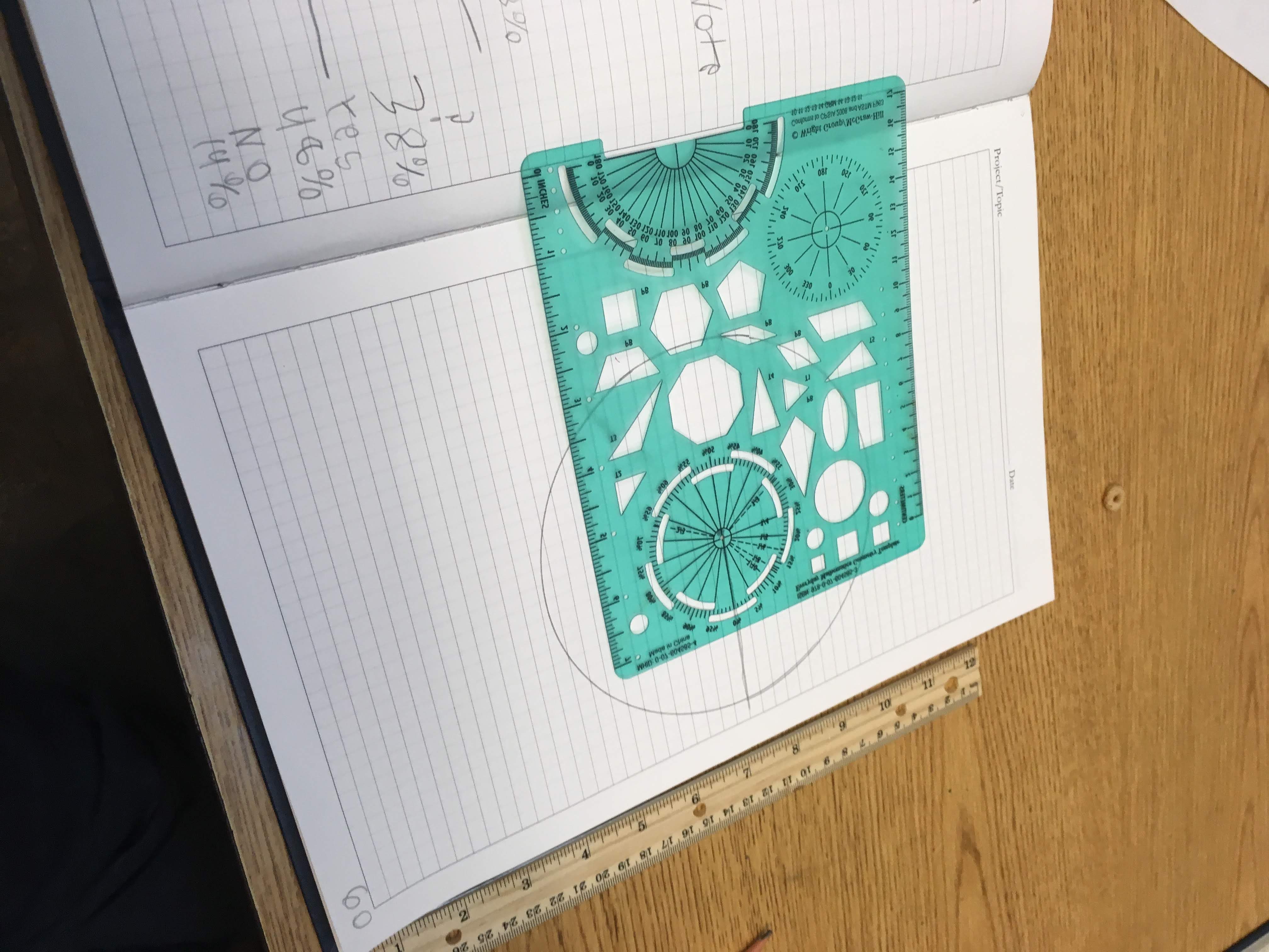
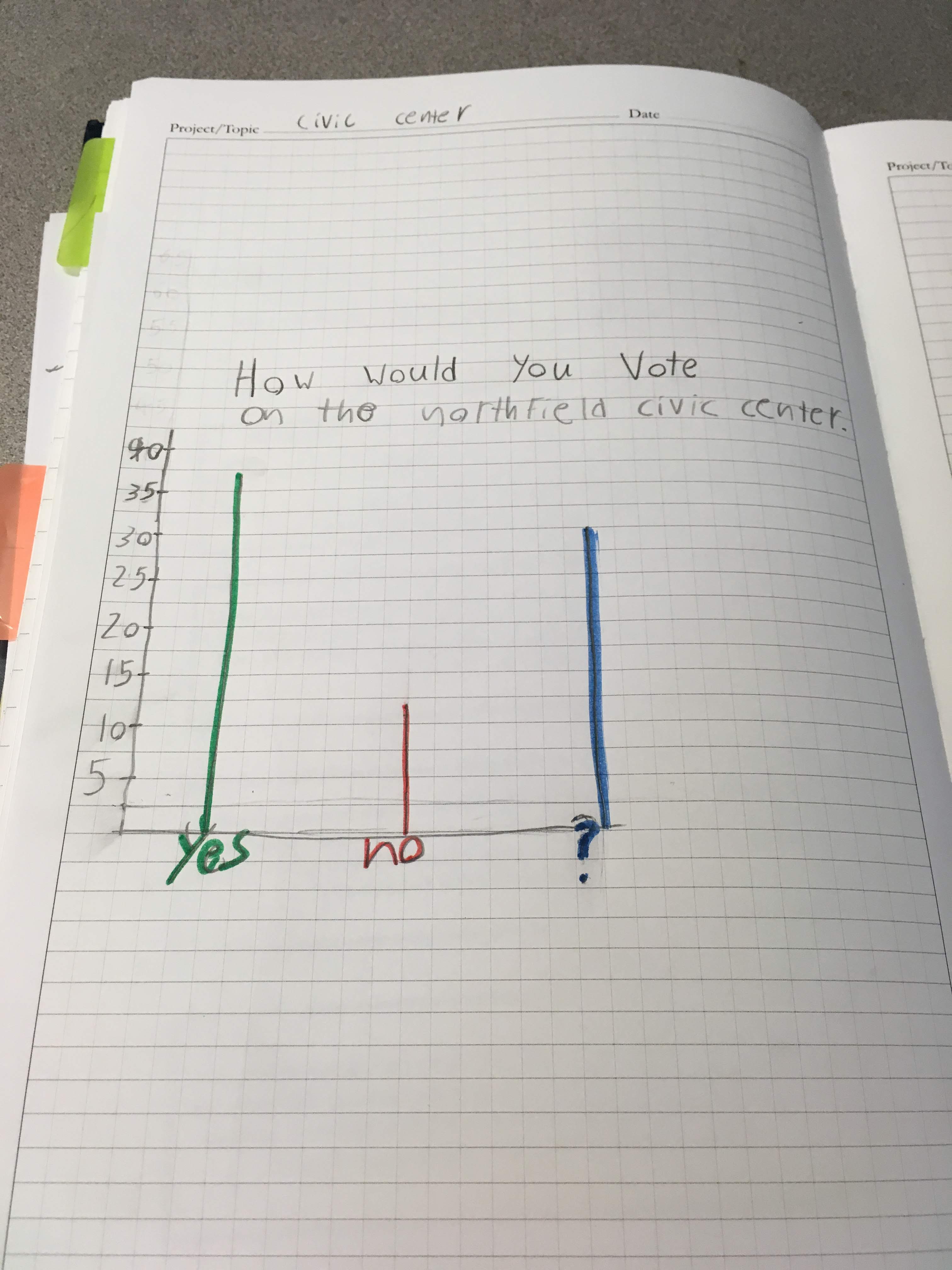
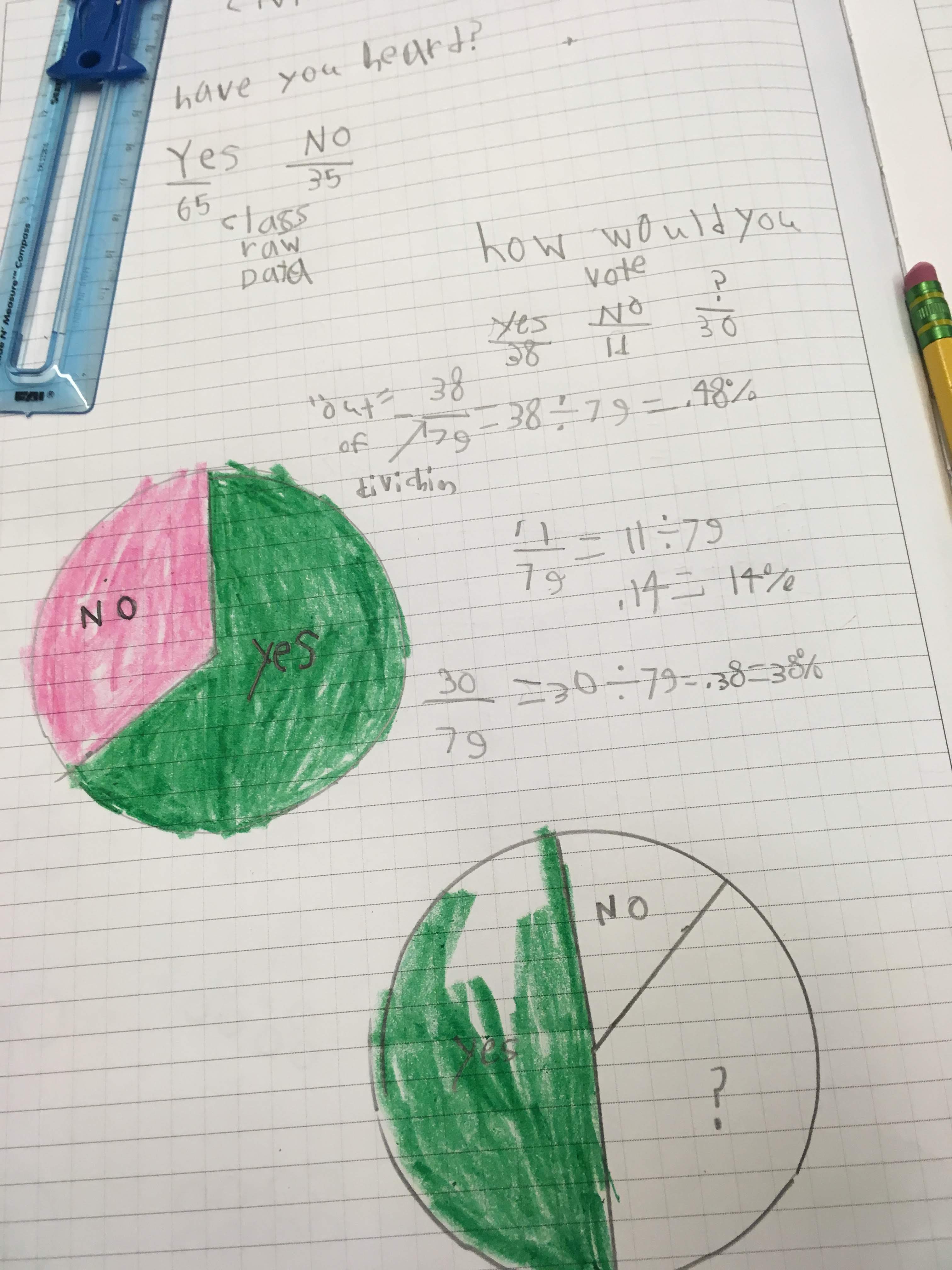
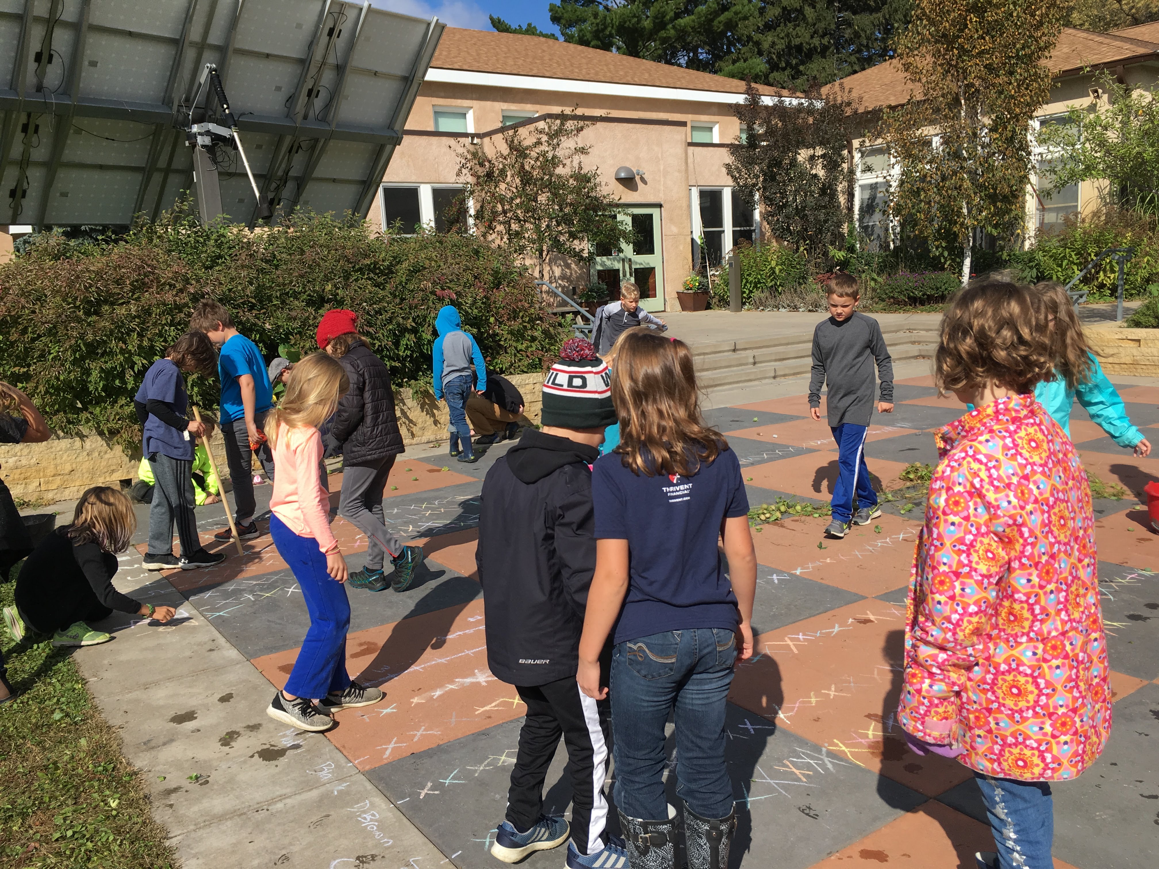
This past week, we crunched the data we collected about the Northfield Civic Center. First of all, we had to determine how many people we surveyed — 100! (Thank goodness everyone did the homework…it made finding percentages a lot more straight forward.) Then we decided what we wanted to know more about. It seemed like a lot of work for everyone to look at everyone else's sheets to get an idea of how many people had heard about the civic center or were going to vote for it. So we collected the information from everyone as tallies.
So far, so good. But it still wasn't easy to compare the data or tell at a glance how people felt. The point of a lot of data handling is to be able to see trends and make predictions. By using the data in certain ways, we can get a clearer idea of what is going on.
At this point, some students chose to make bar graphs and others chose to make circle graphs. We agreed that both gave us a way to compare proportions – which answers were the most popular and by how much. The circle graph had the added advantage of being more general.
The kids who were working on the bar graphs soon realized it would be a pain to have to make their vertical axis count by ones…they tried a bigger interval to save time. Others realized that the graph had to be labeled on the lines, not on the interval (this is something that kids struggle with for a while as they get a sense of all of the numbers between two whole numbers). There were a lot of decisions that had to be made but soon the data started to come into focus:


Wild Cucumber Data
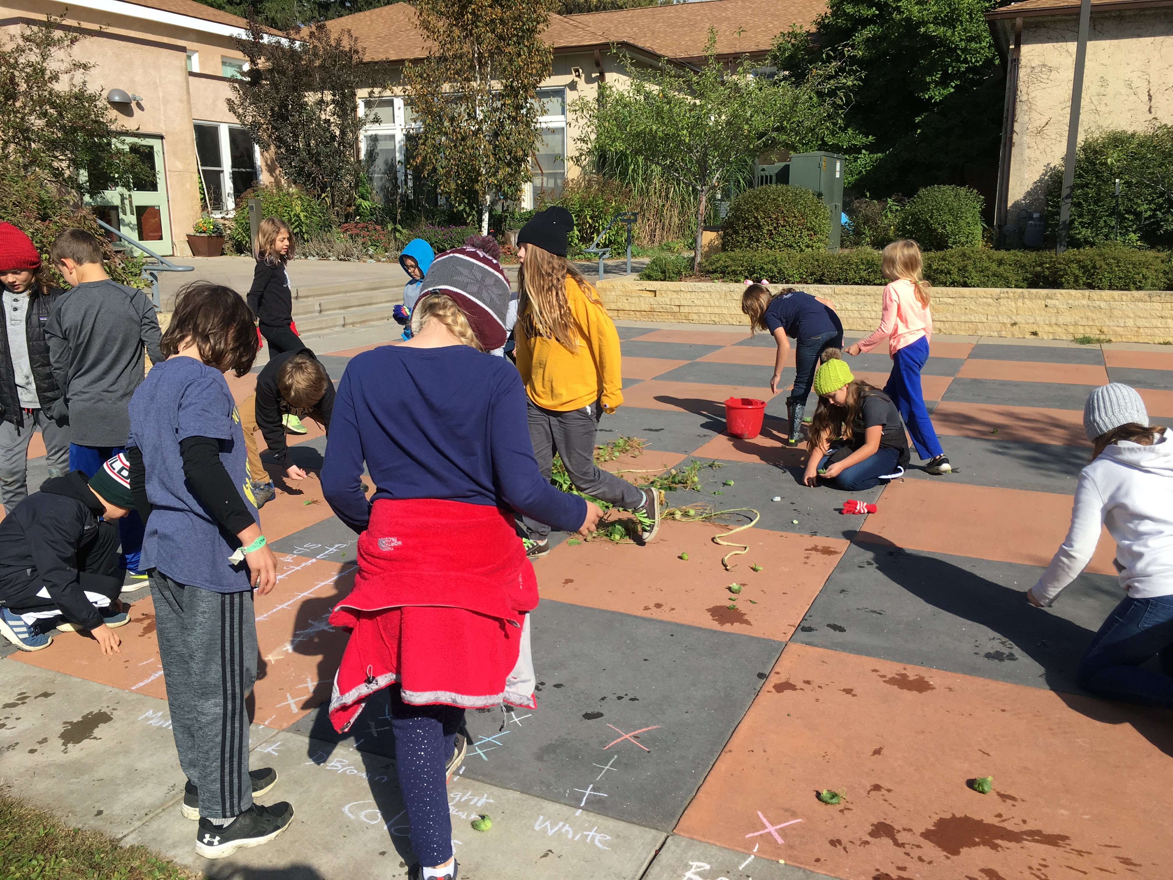
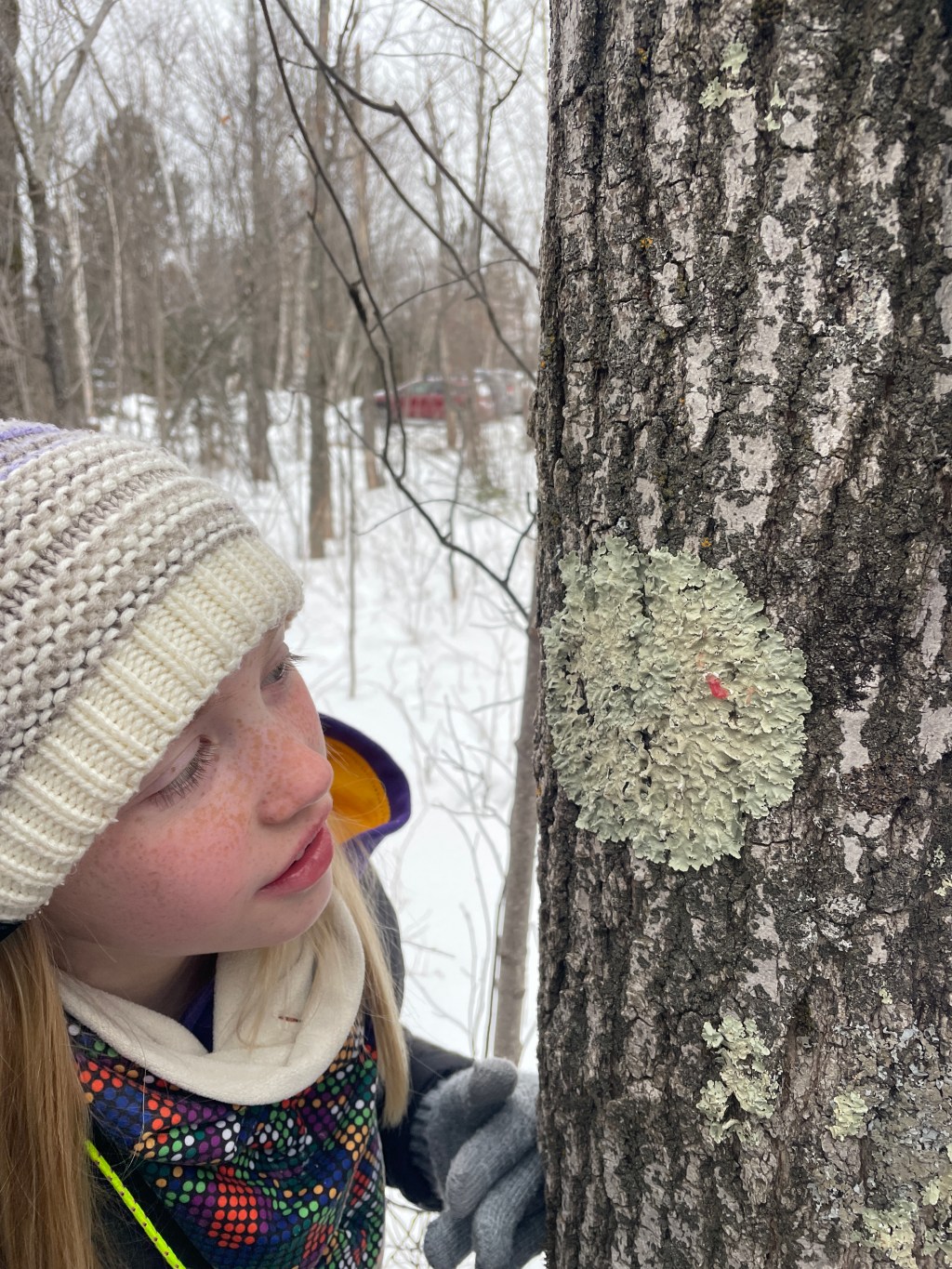
While we were on our hike with John Lattimer, we started to open up a lot of wild cucumbers. Some had four seeds, some had two…some were light brown, some dark brown. All we had were a few examples – we didn't know if they were rare or not.
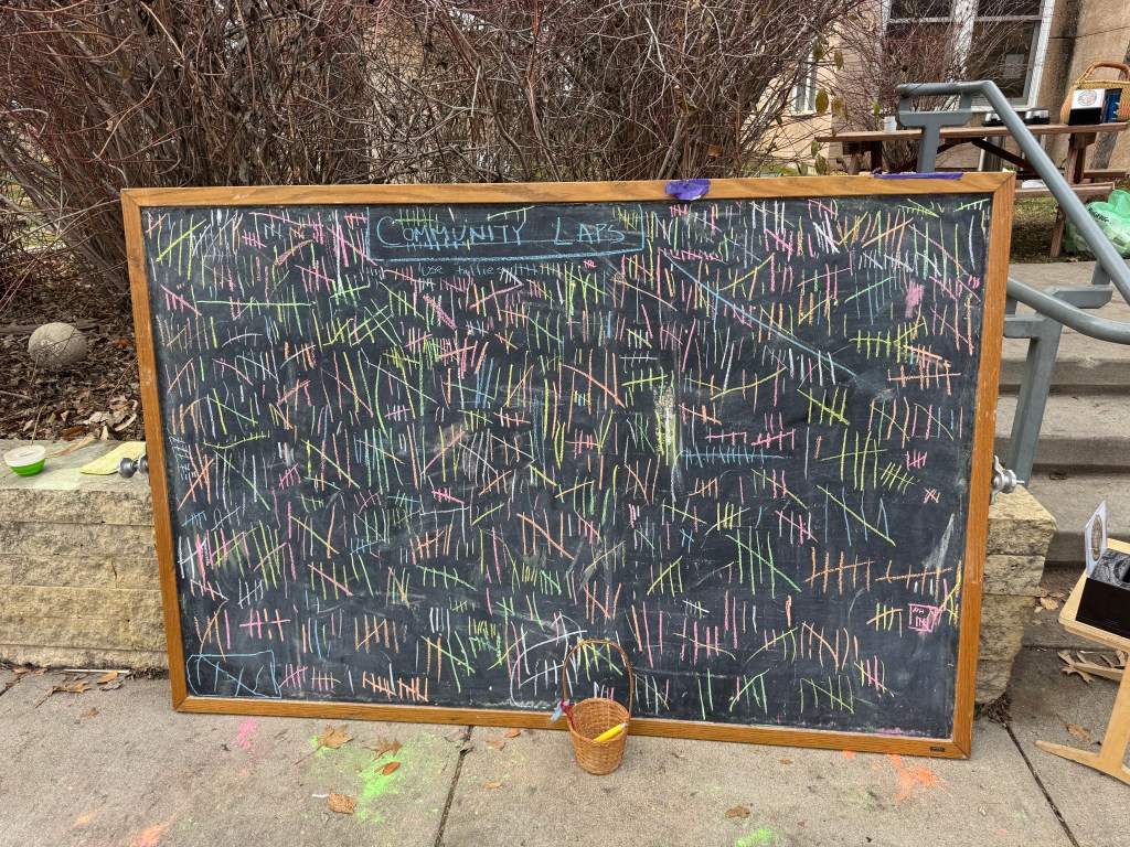
On Wednesday, we decided to find out. We collected and opened 157 cucumbers – and created a line plot of our data on the plaza. Of course, first we had to decide what our graphs would collect information on – number of seeds and color of seeds. Would we count each seed? That would be a lot. If we counted each pod then both graphs would be easier to compare. Then we had to decide how large to make our plot marks (it was hard to make them all the same size so that our comparisons were accurate.
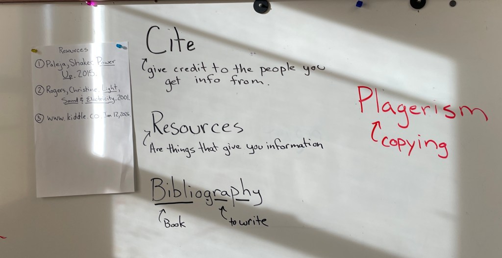
As we opened our pods, more challenges developed. Some pods had more than the maxiumum we had put on our graph (more columns were added). New colors were discovered (likewise, more columns were added.) Then we realized that some people were marking a pod twice if it had two different colors of seeds in it. Others were marking it where the majority of the seeds fit. What to do? We decided that, we would use the majority color. Then some kids realized that what they were calling dark brown, others were calling black…and what counted as "mixed"? We talked about how we could have used photos of each color so that everyone would have the same definition.
In fact, the very first week we collected data about our phenology trees, we looked at pictures and read definitions for what each phenophase was so that our data could be used with the data of other citizen scientists. By doing our wild cucumber data from scratch, we saw how easy it was to make assumptions that everyone was thinking the same way we were when, in fact, they weren't.
Using real data is a lot messier than doing a worksheet. We often have to stop everything and re-group. We make mistakes. Sometimes we have to start over completely. It can be pretty confusing. But if we didn't use the real data and have to make so many decisions, we wouldn't realize how many decisions were behind every graph and statistic we encounter. By realizing that some of us were considering light brown one thing and others something else, students see how the design of an experiment or survey can determine the data we get. Students become more critical consumers of statistics. They learn to ask questions about who was asked, how many people were asked, how were categories made…They learn to think.


Leave a comment